Tag: statistics

Open Data

Despesas de Custeio e Lei de Benford

* This post is in Portuguese.

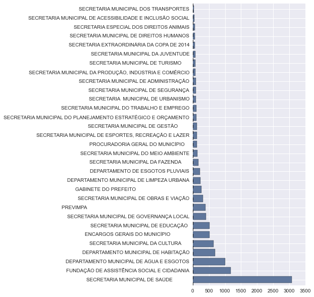
Há poucos dias, a prefeitura de Porto Alegre liberou os datasets com os dados de despesas de custeio de vários órgãos municipais (Secretaria Municipal de Saúde, Secretaria Municipal de Cultura, Gabinete do Prefeito, etc.).  O plot abaixo mostra a quantidade de empenhos para cada órgão municipal:

Plot - Qtd Empenhos vs Órgãos
Plot – Qtd Empenhos vs Órgãos

Uma das maneiras utilizadas geralmente para verificar fraudes é o uso da Lei de Benford [1] [2] [3], que fala sobre a distribuição das frequências de dígitos em vários datasets da vida real, incluindo valores de ações, número de populações, tamanhos de rios, etc.

Ao correlacionar a distribuição de números dos primeiros digitos dos valores de empenhos dos dados de Despesas de Custeio do 2º bimestre de 2014 com a distribuição da Lei de Benford,  a correlação ficou muito clara:


Lei de Benford vs Despesas de Custeio (Empenho)

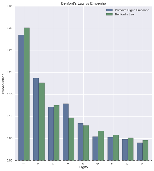
Segue aí mais um exemplo de correlação da Lei de Benford. Um sistema legal para ser construído seria um monitor de despesas que verificasse a correlação da Lei de Benford automaticamente e alertasse a cada anomalia encontrada.

Python

Review Board – Review Requests plotting using Python

Review Board is one of these projects that Python community is always proud of, I really think that it became the de facto standard for code reviews nowadays. Review Board comes with an interesting an very useful REST API which you can use to retrieve information about the code reviews, comments, diffs and every single information stored on its database. So, I created a small Python script called rbstats that retrieves information about the Review Requests done by the users and then plots a heat map using matplotlib. I’ll show an example of the use on the Review Board system of the Apache foundation.

To use the tool, just call it with the API URL of the Review Boars system, i.e.:

python rb_stats.py
--max-results 80 https://reviews.apache.org/api

an then you’ll get a graphical plot like this (click to enlarge):

Where the “hottest” points are weighted according to the number of the code reviews that the user have created to the other axis user. You can also plot the statistics by user, for instance of the user benjaminhindman using the autumn colormap and with 400 max results:

python rb_stats.py 
--max-results 400 
--from-user benjaminhindman 
--colormap autumn https://reviews.apache.org/api


Click to enlarge the image:

I'm starting a new course "Machine Learning: Foundations and Engineering" for 2024.