Tag: matplotlib

Python

Review Board – Review Requests plotting using Python

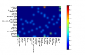
Review Board is one of these projects that Python community is always proud of, I really think that it became the de facto standard for code reviews nowadays. Review Board comes with an interesting an very useful REST API which you can use to retrieve information about the code reviews, comments, diffs and every single information stored on its database. So, I created a small Python script called rbstats that retrieves information about the Review Requests done by the users and then plots a heat map using matplotlib. I’ll show an example of the use on the Review Board system of the Apache foundation.

To use the tool, just call it with the API URL of the Review Boars system, i.e.:

python rb_stats.py
--max-results 80 https://reviews.apache.org/api

an then you’ll get a graphical plot like this (click to enlarge):

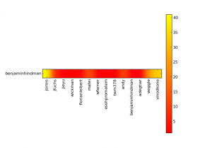
Where the “hottest” points are weighted according to the number of the code reviews that the user have created to the other axis user. You can also plot the statistics by user, for instance of the user benjaminhindman using the autumn colormap and with 400 max results:

python rb_stats.py 
--max-results 400 
--from-user benjaminhindman 
--colormap autumn https://reviews.apache.org/api


Click to enlarge the image:

Math

Riemann Zeta function visualizations with Python

While playing with mpmpath and it’s Riemann Zeta function evaluator, I came upon those interesting animated plottings using Matplotlib (the source code is in the end of the post).

Riemann zeta function is an analytic function and is defined over the complex plane with one complex variable denoted as “s“. Riemann zeta is very important to mathematics due it’s deep relation with primes; the zeta function is given by:

\zeta(s) = \sum_{n=1}^\infty \frac{1}{n^s} = \frac{1}{1^s} + \frac{1}{2^s} + \frac{1}{3^s} + \cdots

for Re(s) > 1.

So, let \zeta(s)=v where s = a + b\imath and v = u + k\imath.

The first plot uses the triplet (x,y,z) coordinates to plot a 3D space where each component is given by:

  • x = Re(v) (or x = u, previously defined);
  • y = Im(v) (or y = k, previously defined);
  • z = Im(s) (or z = b, previously defined);
  • The time component used in the animation is called \theta and it’s given by \theta = Re(s) or simply \theta = a.

To plot the animation I’ve used the follow intervals:

  • For Re(s): from \left[0.01, 10.0\right), this were calculated at every 0.01 step – shown in the plot at top right;
  • For Im(s): from \left[0.1, 200.0\right), calculated at every 0.1 step – shown as the z axis.

This plot were done using a fixed interval (no auto scale) for the (x,y,z) coordinates. Where Re(s) = 1/2 (\theta = 1/2) is when the non-trivial zeroes of Riemann Zeta function lies.

Now see the same plot but this time using auto scale (automatically resized x,y coordinates):

Note the (x,y) auto scaling.

See now from another plotting using a 2D space where each component is given by:

  • x = Im(s) (or x = b, previously defined);
  • y = Im(v) (blue) and Re(v) (green);
  • The time component used in the animation is called \theta and it’s given by \theta = Re(s) or simply \theta = a.

To plot the animation I’ve used the follow intervals:

  • For Re(s): from \left[0.01,  10.0\right), this were calculated at every 0.01 step – shown in title of the plot at top;
  • For Im(s): from \left[0.1, 50.0\right), calculated at every 0.1 step – shown as the x axis.

This plot were done using a fixed interval (no auto scale) for the (x,y) coordinates. Where Re(s) = 1/2 (\theta = 1/2) is when the non-trivial zeroes of Riemann Zeta function lies. The first 10 non-trivial zeroes from Riemann Zeta function is shown as a red dot, when the two series, the Im(v) and Re(v) cross each other on the red dot at the critical line (Re(s) = 1/2) is where lies the zeroes of the Zeta Function, note how the real and imaginary part turns away from each other as the Re(s) increases.

Now see the same plot but this time using auto scale (automatically resized y coordinate):

If you are interested in more visualizations of Riemann Zeta function, you’ll like the well-done paper from J. Arias-de-Reyna called “X-Ray of Riemann zeta-function“.

I always liked the way visualization affects the understanding of math functions. Anscombe’s quartet is a clear example of how important visualization is.

The source-code used to create the plot are available here:

Source code for the 2D plots

Source code for the 3D plots

I hope you liked the post ! To make the plots and videos I’ve used matplotlib, mpmath and MEncoder.

– Christian S. Perone

Python

Exploring real-time Haiti USGS Earthquake data with near real-time MODIS Aqua+Terra satellite imagery using Python

Some time ago I’d done a post about acessing the MODIS near-real time satellite images using Python and the data public available at NASA MODIS, if you are interested in those images, take a look in the post here.

I’ve created now a Python package called pyearthquake to automatic retrieve any MODIS subset image from the NASA Rapid Response System in a easy way, just by using the subset, satellite and resolution parameters. The package has a module to get real-time USGS Earthquake data from the USGS website and automatically parse it for you, as well functions to retrieve shakemaps and other products from the USGS.

Retrieving, handling and ploting USGS data

Let’s start talking about the public available catalogs with real-time Earthquake data from the USGS site (they are in CSV formats, there are others in XML and KMZ formats if you’re interested too, but I focused in the CSV format files to create the Python modules:

Note from USGS site: files are not inclusive (the past day file does not include past hour events, for example).

M1+ Earthquakes (past hour) – M1+PAST_HOUR

This is the worldwide catalog with earthquake data from the past hour;

M1+ Earthquakes (past day) – M1+PAST_DAY

This is the worldwide catalog with earthquake data from the past day;

M1+ Earthquakes (past 7 days) – M1+PAST_7DAY

This is the worldwide catalog with earthquake data from the past 7 days;

To get and process data from these catalogs, you can use the pyearthquake package I created, let’s install it first:

easy_install pyearthquake

This command will use the easy_install to automatic install the package from the PyPI respository, it will automatically resolve the requirements too, but if you face some problem, here is the explicit requirements: matplotlib >= 0.99.0, numpy >= 1.3.0, PIL >= 1.1.6 and basemap >= 0.99.4. The basemap package is map toolkit for matplotlib.

Let’s now, for example, get the catalog for the past hour earthquake data, we can do it by using the Python interpreter prompt, like this:

>>> catalog = usgs.retrieve_catalog("M1+PAST_HOUR")
>>> catalog
<pyearthquake.usgs.USGSCatalog instance at 0x00BD0FD0>

All catalogs available are: M1+PAST_HOUR, M1+PAST_DAY and M1+PAST_7DAY. But if you type a wrong catalog name, it will show you the name of all available.

You can now work with the “catalog” object to explore the data retrieved from the USGS site:

>>> list(catalog)
[{'Src': 'ci', 'Region': 'Central California', 'Lon': '-118.2063', 'Datetime': 'Saturday, January 16, 2010 17:12:20 UTC', 'Depth':
 '6.00', 'Version': '1', 'Lat': '36.2061', 'Eqid': '10530221', 'Magnitude': '1.9', 'NST': '27'}, {'Src': 'ak', 'Region': 'Southern
 Alaska', 'Lon': '-150.0829', 'Datetime': 'Saturday, January 16, 2010 16:47:05 UTC', 'Depth': '34.90', 'Version': '1', 'Lat': '61.
4521', 'Eqid': '10029267', 'Magnitude': '2.3', 'NST': '27'}]
>>> for row in catalog:
...    print row["Magnitude"], row["Depth"], row["Datetime"], row["Depth"], row["Region"]
...
1.9 6.00 Saturday, January 16, 2010 17:12:20 UTC 6.00 Central California
2.3 34.90 Saturday, January 16, 2010 16:47:05 UTC 34.90 Southern Alaska

As you can see, the “catalog” is an interable object where you can get all data from the earthquakes, like the Magnitude, Latitude, Longitude, Depth, Date, Region Name, etc…

Let’s now get the past 7 days earthquake data:

>>> catalog = usgs.retrieve_catalog("M1+PAST_7DAY")
>>> len(catalog)
1142

In the past 7 days, there was 1.142 Magnitude 1+ earthquakes on earth, if we want to find the event for the last Haiti tragedy, we can filter the Magnitude of the catalog by 6.0 for example:

>>> magnitude6 = [event for event in catalog if float(event["Magnitude"]) >= 6.0]
>>> len(magnitude6)
3
>>> for row in magnitude6:
...    print row["Eqid"], row["Magnitude"], row["Depth"], row["Datetime"], row["Depth"], row["Region"]
...
2010rla9 6.0 32.40 Thursday, January 14, 2010 14:03:40 UTC 32.40 south of the Mariana Islands
2010rja6 7.0 13.00 Tuesday, January 12, 2010 21:53:10 UTC 13.00 Haiti region
71338066 6.5 29.30 Sunday, January 10, 2010 00:27:39 UTC 29.30 offshore Northern California

As we can see, the Earthquake ID “2010rja6” was the ID used by USGS to identify the 7.0 magnitude Haiti earthquake of the 12 January which has devastated the region and the unfortunate people of Haiti.

USGS also provides a Shakemaps, which are automatic computer generated maps with the potential damage in the region of the earthquake, to get it, let’s use the pyearthquake package:

>>> haiti_eq = magnitude6[1]
>>> usgs.retrieve_shakemap(haiti_eq, "INSTUMENTAL_INTENSITY")
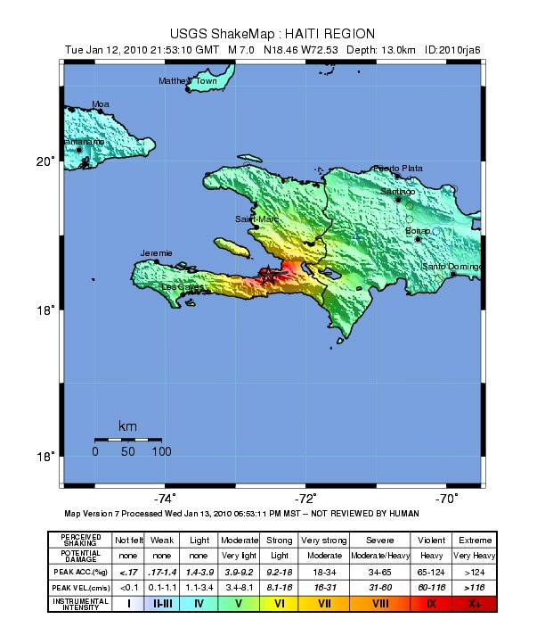
The second argument of the function is the shakemap type, there are other products you can get from USGS too, like the Media Maps, Peak Ground Acceleration. These maps are available in the package as: INSTRUMENTAL_INTENSITY, BARE, DECORATED, UNCERTAINTY and PEAK_GROUND_ACC.

The packas has functions to plot maps of the earthquakes (using Matplotlib), see how to plot a map of the earthquakes from the past 7 days:

>>> usgs.plot_events(catalog)
<mpl_toolkits.basemap.Basemap object at 0x01E6BDB0>
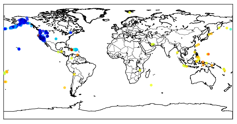
Now a zoom in the Haiti region:

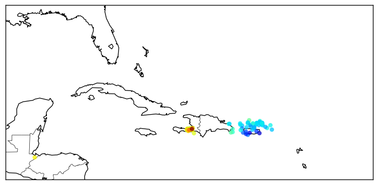
The color of the points are relative to their magnitudes, I’m using here the JET (the yellow/red points are earthquakes with higher magnitudes) color map from Matplotlib, see in this link to use more color maps.

Retrieving last images from MODIS Satellites and ploting earthquakes

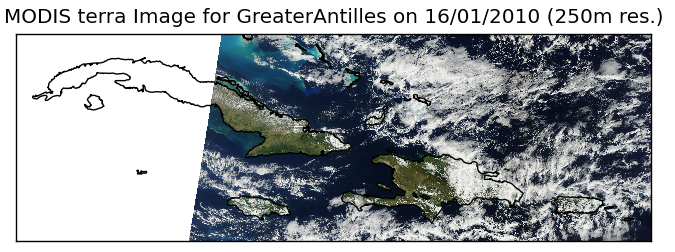
Let’s talk now about the “modis” module of the pyearthquake module. This module can be used to get the most recent or archived images (up to 250m resolution) from MODIS Aqua/Terra satellites. First of all, you must know what subset you want to retrieve from MODIS website, the subsets are available here in NASA site. To plot the Haiti region I’ll use the subset named “GreaterAntilles” which covers the Haiti region. To get the satellite images from today date, we can do like this:

>>> from pyearthquake import modis
>>> import datetime
>>> now = datetime.datetime.now()
>>> bmap = modis.get_modis_subset(now,
...                               "GreaterAntilles",
...                               satellite_name="terra",
...                               resolution="250m")

This command will get the composite image of the subset “GreaterAntilles” taken today from the “terra” satellite with a resolution of 250m (in fact, this will take a while, since I’m using a higher resolution here, the maximum is 250m). And here is the result:
And here is after a zoom into the Haiti region near of  Port-au-Prince:
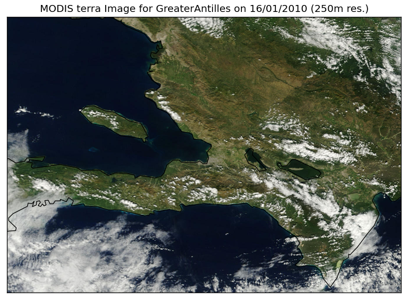
This is the interesting part about MODIS, this photo, is from TODAY.

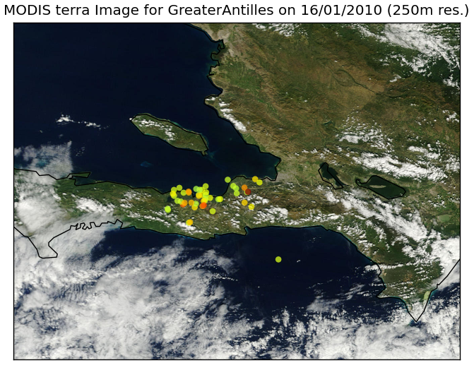
Now, let’s merge together the information about the earthquakes from the USGS data and the recent images from the Haiti:

import datetime
from pyearthquake import usgs
from pyearthquake import modis

catalog = usgs.retrieve_catalog("M1+PAST_7DAY")

now = datetime.datetime.now()
bmap = modis.get_modis_subset(now,
                              "GreaterAntilles",
                              satellite_name="terra",
                              resolution="250m",
                              show=False)
usgs.plot_events(catalog, bmap)

And here is the result of the past 7 days earthquakes plot over the today MODIS image from satellite Terra:
That’s all =) you can use the package to plot earthquakes over other regions of world too, just select another subset from the MODIS Rapid Response System site.

– Christian S. Perone

All images and data shown here are from MODIS Response System or U.S. Geological Survey.
News, Python, Science

An analysis of Benford’s law applied to Twitter

Benford’s law is one of those very weird things that we can’t explain, and when we discover more and more phenomena that obey the law, we became astonished. Two people (Simon Newcomb – 1881 and Frank Benford – 1938) noted the law in the same way, while flipping pages of a logarithmic table book; they noticed that the pages at the beginning of the book were dirtier than the pages at the end.

Currently, there are no a priori criteria that say to us when a dataset will or will not obey the Benford’s Law. And it is because of this, that I’ve done an analysis on the Twitter Public Timeline.

The Twitter API to get Public Timeline is simply useless for this analysis because in the API Docs, they say that the Public Timeline is cached for 60 seconds ! 60 seconds is an eternity, and there is a request rating of 150 request/hour. So, it doesn’t help, buuuuuut, there is an alpha testing API with pretty and very useful streams of data from the Public Timeline; there are many methods in the Twitter Streaming API, and the most interesting one is the “Firehose”, which returns ALL the public statuses, but this method is only available for intere$ting people, and I’m not one of them. Buuuut, we have “Spritzer”, which returns a portion of all public statuses, since it’s only what we have available in the moment, it MUST be useful, and it’s a pretty stream of data =)

So, I’ve got the Spritzer real-time stream of data and processed each new status which arrived with a regex to find all the numbers in the status; if the status was “I have 5 dogs and 3 cats”, the numbers collected should be “[5, 3]”. All those accumulated numbers were then checked against the Benford’s Law. I’ve used Matplotlib to plot the two curves (the Benford’s Law and the Twitter statuses digits distribution) to empirically observe the correlation between them. You can note in the upper right corner of the video, the Pearson’s correlation between the two distributions too.

Here is the video (I’ve seen only after creating of the video, but the color of  the curves are the inverse as seen in the legend):

The video represents the 15 minutes (3.160 captured statuses) of the Twitter Public Timeline. At the end of the video, you can see a Pearson’s correlation of 0.95. It seems that we have found another Benford’s son =)

The little tool to handle the Twitter Spritzer stream of data and plot the correlation graph in real-time was entirely written in Python, I’ll do a clean-up and post it here soon I got time. The tool has generated 1823 png images that were merged using ffmpeg.

I hope you enjoyed =)

Cite this article as: Christian S. Perone, "An analysis of Benford’s law applied to Twitter," in Terra Incognita, 11/08/2009, https://blog.christianperone.com/2009/08/an-analysis-of-benfords-law-applied-to-twitter/.

UPDATE 11/08: the user “poobare” has cited an interesting paper about Benford’s Law on Reddit, here is the link.

More posts about Benford’s Law

Prime Numbers and the Benford’s Law

Delicious.com, checking user numbers against Benford’s Law

Benford’s Law meets Python and Apple Stock Prices

Python

Python: acessing near real-time MODIS images and fire data from NASA’s Aqua and Terra satellites

From Modis Rapid Response System site:

The MODIS Rapid Response System was developed to provide daily satellite images of the Earth’s landmasses in near real time. True-color, photo-like imagery and false-color imagery are available within a few hours of being collected, making the system a valuable resource (…).
The Moderate Resolution Imaging Spectroradiometer (MODIS) flies onboard NASA’s Aqua and Terra satellites as part of the NASA-centered international Earth Observing System. Both satellites orbit the Earth from pole to pole, seeing most of the globe every day. Onboard Terra, MODIS sees the Earth during the morning, while Aqua MODIS orbits the Earth in the afternoon.

One thing that a few people know is that everyone can have access to a near real-time moderate resolution images from two NASA satellites (Aqua and Terra) which orbits the earth from pole to pole every day and captures images and data like thermal anomalies from the most part of the globe.

In this post, I’ll show how to get and plot those imagery and data to a map using Python and Matplotlib + Basemap toolkit.

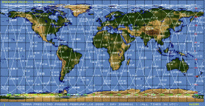
The Aqua and Terra orbits

The "Terra" orbit

(more…)

I'm starting a new course "Machine Learning: Foundations and Engineering" for 2024.