Genetic Algorithms, Pyevolve, Python

The future can be written in RPython now

Following the recent article arguing why PyPy is the future of Python, I must say, PyPy is not the future of Python, is the present. When I have tested it last time (PyPy-c 1.1.0) with Pyevolve into the optimization of a simple Sphere function, it was at least 2x slower than Unladen Swallow Q2, but in that time, PyPy was not able to JIT. Now, with this new release of PyPy and the JIT’ing support, the scenario has changed.

PyPy has evolved a lot (actually, you can see this evolution here), a nice work was done on the GC system, saving (when compared to CPython) 8 bytes per object allocated, which is very interesting for applications that makes heavy use of object allocation (GP system are a strong example of this, since when they are implemented on object oriented languages, each syntax tree node is an object). Efforts are also being done to improve support for CPython extensions (written in C/C++), one of them is a little tricky: the use of RPyC, to proxy through TCP the remote calls to CPython; but the other seems by far more effective, which is the creation of the CPyExt subsystem. By using CPyExt, all you need is to have your CPython API functions implemented in CPyExt, a lot of people is working on this right now and you can do it too, it’s a long road to have a good API coverage, but when you think about advantages, this road becomes small.

In order to benchmark CPython, Jython, CPython+Psyco, Unladen Swallow and PyPy, I’ve used the Rastrigin function optimization (an example of that implementation is here in the Example 7 of Pyevolve 0.6rc1):

f(x) = 10n + \sum_{i=1}^{n}{x_{i}^{2}} -10\cos(2\pi x_{i})

Due to its large search space and number of local minima, Rastrigin function is often used to measure the performance of Genetic Algorithms. Rastrigin function has a global minimum at x=0 where the f(x) = 0; in order to increase the search space and required resources, I’ve used 40 variables (n=40)  and 10k generations.

Here are the information about versions used in this benchmark:

No warmup was performed in JVM or in PyPy. PyPy translator was executed using the “-Ojit” option in order to get the JIT version of the Python interpreter. The JVM was executed using the server mode, I’ve tested the client and server mode for Sun JVM and IcedTea6, the best results were observed from the server mode using Sun JVM, however when I’ve compared the client mode of IcedTea6 with the client mode of Sun JVM, the best results observed were from IcedTea6 (the same as using server mode in IcedTea6). Unladen Swallow was compiled using the project wiki instructions for building an optimized binary.

The machine used was an Intel(R) Core(TM) 2 Duo E4500 (2×2.20Ghz) with 2GB of RAM.

The result of the benchmark (measured using wall time) in seconds for each setup (these results are the best of 3 sequential runs):

As you can see, PyPy with JIT got a speedup of 2.57x when compared to CPython 2.6.5 and 2.0x  faster than Unladen Swallow current trunk.

PyPy is not only the future of Python, but is becoming the present right now. PyPy will not bring us only an implementation of Python in Python (which in itself is the valuable result of great efforts), but also will bring the performance back (which many doubted at the beginning, wondering how could it be possible for an implementation of Python in Python be faster than an implementation in C ? And here is where the translation and JIT magic enters). When the time comes that Python interpreter can be entire written in a high level language (actually almost the same language, which is really weird), Python community can put their focus on improving the language itself instead of spending time solving the complexity of the lower level languages, is this not the great point of those efforts ?

By the way, just to note, PyPy isn’t only a translator for the Python interpreter written in RPython, it’s a translator of RPython, what means that PyPy isn’t only the future of Python, but probably, the future of many interpreters.

Genetic Algorithms, genetic programming, News, Pyevolve, Python

Pyevolve 0.6rc1 released !

I’m proud to announce the Pyevolve 0.6rc1 ! This is the first release candidate, but it’s pretty stable for production use (as from this 0.6 version we are very closer to a stable codebase, thanks to community).

See the documentation site and the What’s New.

I would like to thank the people who directly or indirectly have contributed with this release: Boris Gorelik, Amit Saha, Jelle Feringa, Henrik Rudstrom, Matteo de Felice, SIGEVOlution Board, Mike Benoit, Ryan Campbell, Jonas A. Gustavsson, Soham Sadhu, Ernesto Costa, Ido Ben-Tsion, Frank Goodman, Vishal Belsare, Benjamin Bush; and a lot of people who gave us feedback of the experience with the use of Pyevolve on their applications.

For downloads, go to the Downloads section at Documentation site.

If you see something wrong with this release candidate, please create a ticket reporting your problem at Pyevolve Trac, so we can provide fixes to the official release.

Happy coding !

– Christian S. Perone

Math

Riemann Zeta function visualizations with Python

While playing with mpmpath and it’s Riemann Zeta function evaluator, I came upon those interesting animated plottings using Matplotlib (the source code is in the end of the post).

Riemann zeta function is an analytic function and is defined over the complex plane with one complex variable denoted as “s“. Riemann zeta is very important to mathematics due it’s deep relation with primes; the zeta function is given by:

\zeta(s) = \sum_{n=1}^\infty \frac{1}{n^s} = \frac{1}{1^s} + \frac{1}{2^s} + \frac{1}{3^s} + \cdots

for Re(s) > 1.

So, let \zeta(s)=v where s = a + b\imath and v = u + k\imath.

The first plot uses the triplet (x,y,z) coordinates to plot a 3D space where each component is given by:

  • x = Re(v) (or x = u, previously defined);
  • y = Im(v) (or y = k, previously defined);
  • z = Im(s) (or z = b, previously defined);
  • The time component used in the animation is called \theta and it’s given by \theta = Re(s) or simply \theta = a.

To plot the animation I’ve used the follow intervals:

  • For Re(s): from \left[0.01, 10.0\right), this were calculated at every 0.01 step – shown in the plot at top right;
  • For Im(s): from \left[0.1, 200.0\right), calculated at every 0.1 step – shown as the z axis.

This plot were done using a fixed interval (no auto scale) for the (x,y,z) coordinates. Where Re(s) = 1/2 (\theta = 1/2) is when the non-trivial zeroes of Riemann Zeta function lies.

Now see the same plot but this time using auto scale (automatically resized x,y coordinates):

Note the (x,y) auto scaling.

See now from another plotting using a 2D space where each component is given by:

  • x = Im(s) (or x = b, previously defined);
  • y = Im(v) (blue) and Re(v) (green);
  • The time component used in the animation is called \theta and it’s given by \theta = Re(s) or simply \theta = a.

To plot the animation I’ve used the follow intervals:

  • For Re(s): from \left[0.01,  10.0\right), this were calculated at every 0.01 step – shown in title of the plot at top;
  • For Im(s): from \left[0.1, 50.0\right), calculated at every 0.1 step – shown as the x axis.

This plot were done using a fixed interval (no auto scale) for the (x,y) coordinates. Where Re(s) = 1/2 (\theta = 1/2) is when the non-trivial zeroes of Riemann Zeta function lies. The first 10 non-trivial zeroes from Riemann Zeta function is shown as a red dot, when the two series, the Im(v) and Re(v) cross each other on the red dot at the critical line (Re(s) = 1/2) is where lies the zeroes of the Zeta Function, note how the real and imaginary part turns away from each other as the Re(s) increases.

Now see the same plot but this time using auto scale (automatically resized y coordinate):

If you are interested in more visualizations of Riemann Zeta function, you’ll like the well-done paper from J. Arias-de-Reyna called “X-Ray of Riemann zeta-function“.

I always liked the way visualization affects the understanding of math functions. Anscombe’s quartet is a clear example of how important visualization is.

The source-code used to create the plot are available here:

Source code for the 2D plots

Source code for the 3D plots

I hope you liked the post ! To make the plots and videos I’ve used matplotlib, mpmath and MEncoder.

– Christian S. Perone

Genetic Algorithms, genetic programming, News, Science

New issue of SIGEVOlution (Volume 4 Issue 3)

The new issue of SIGEVOlution (the newsletter of ACM Special Interest Group on Genetic and Evolutionary Computation) was released:

In this release you can read about:

Issues in applying computational intelligence
By Arthur Kordon

JavaXCSF
By Patrick O. Stalph, Martin V. Butz

And a lot of information about new PhD theses, new journal issues and about events to come.

Genetic Algorithms, News, Science

News: Using genetic algorithms to optimise current and future health planning

From a publication of 28/10/2010, of the authors Saoshi Sasaki, Alexis J Comber, Hiroshi Suzuki and Chris Brunsdon:

Background

Ambulance response time is a crucial factor in patient survival. The number of emergency cases (EMS cases) requiring an ambulance is increasing due to changes in population demographics. This is decreasing ambulance response times to the emergency scene. This paper predicts EMS cases for 5-year intervals from 2020, to 2050 by correlating current EMS cases with demographic factors at the level of the census area and predicted population changes. It then applies a modified grouping genetic algorithm to compare current and future optimal locations and numbers of ambulances. Sets of potential locations were evaluated in terms of the (current and predicted) EMS case distances to those locations.

Results

Future EMS demands were predicted to increase by 2030 using the model (R2=0.71). The optimal locations of ambulances based on future EMS cases were compared with current locations and with optimal locations modelled on current EMS case data. Optimising the location of ambulance stations locations reduced the average response times by 57 seconds. Current and predicted future EMS demand at modelled locations were calculated and compared.

Conclusions

The reallocation of ambulances to optimal locations improved response times and could contribute to higher survival rates from life-threatening medical events. Modelling EMS case ‘demand’ over census areas allows the data to be correlated to population characteristics and optimal ‘supply’ locations to be identified. Comparing current and future optimal scenarios allows more nuanced planning decisions to be made. This is a generic methodology that could be used to provide evidence in support of public health planning and decision making.

Read the original paper here.

Python

Exploring real-time Haiti USGS Earthquake data with near real-time MODIS Aqua+Terra satellite imagery using Python

Some time ago I’d done a post about acessing the MODIS near-real time satellite images using Python and the data public available at NASA MODIS, if you are interested in those images, take a look in the post here.

I’ve created now a Python package called pyearthquake to automatic retrieve any MODIS subset image from the NASA Rapid Response System in a easy way, just by using the subset, satellite and resolution parameters. The package has a module to get real-time USGS Earthquake data from the USGS website and automatically parse it for you, as well functions to retrieve shakemaps and other products from the USGS.

Retrieving, handling and ploting USGS data

Let’s start talking about the public available catalogs with real-time Earthquake data from the USGS site (they are in CSV formats, there are others in XML and KMZ formats if you’re interested too, but I focused in the CSV format files to create the Python modules:

Note from USGS site: files are not inclusive (the past day file does not include past hour events, for example).

M1+ Earthquakes (past hour) – M1+PAST_HOUR

This is the worldwide catalog with earthquake data from the past hour;

M1+ Earthquakes (past day) – M1+PAST_DAY

This is the worldwide catalog with earthquake data from the past day;

M1+ Earthquakes (past 7 days) – M1+PAST_7DAY

This is the worldwide catalog with earthquake data from the past 7 days;

To get and process data from these catalogs, you can use the pyearthquake package I created, let’s install it first:

easy_install pyearthquake

This command will use the easy_install to automatic install the package from the PyPI respository, it will automatically resolve the requirements too, but if you face some problem, here is the explicit requirements: matplotlib >= 0.99.0, numpy >= 1.3.0, PIL >= 1.1.6 and basemap >= 0.99.4. The basemap package is map toolkit for matplotlib.

Let’s now, for example, get the catalog for the past hour earthquake data, we can do it by using the Python interpreter prompt, like this:

>>> catalog = usgs.retrieve_catalog("M1+PAST_HOUR")
>>> catalog
<pyearthquake.usgs.USGSCatalog instance at 0x00BD0FD0>

All catalogs available are: M1+PAST_HOUR, M1+PAST_DAY and M1+PAST_7DAY. But if you type a wrong catalog name, it will show you the name of all available.

You can now work with the “catalog” object to explore the data retrieved from the USGS site:

>>> list(catalog)
[{'Src': 'ci', 'Region': 'Central California', 'Lon': '-118.2063', 'Datetime': 'Saturday, January 16, 2010 17:12:20 UTC', 'Depth':
 '6.00', 'Version': '1', 'Lat': '36.2061', 'Eqid': '10530221', 'Magnitude': '1.9', 'NST': '27'}, {'Src': 'ak', 'Region': 'Southern
 Alaska', 'Lon': '-150.0829', 'Datetime': 'Saturday, January 16, 2010 16:47:05 UTC', 'Depth': '34.90', 'Version': '1', 'Lat': '61.
4521', 'Eqid': '10029267', 'Magnitude': '2.3', 'NST': '27'}]
>>> for row in catalog:
...    print row["Magnitude"], row["Depth"], row["Datetime"], row["Depth"], row["Region"]
...
1.9 6.00 Saturday, January 16, 2010 17:12:20 UTC 6.00 Central California
2.3 34.90 Saturday, January 16, 2010 16:47:05 UTC 34.90 Southern Alaska

As you can see, the “catalog” is an interable object where you can get all data from the earthquakes, like the Magnitude, Latitude, Longitude, Depth, Date, Region Name, etc…

Let’s now get the past 7 days earthquake data:

>>> catalog = usgs.retrieve_catalog("M1+PAST_7DAY")
>>> len(catalog)
1142

In the past 7 days, there was 1.142 Magnitude 1+ earthquakes on earth, if we want to find the event for the last Haiti tragedy, we can filter the Magnitude of the catalog by 6.0 for example:

>>> magnitude6 = [event for event in catalog if float(event["Magnitude"]) >= 6.0]
>>> len(magnitude6)
3
>>> for row in magnitude6:
...    print row["Eqid"], row["Magnitude"], row["Depth"], row["Datetime"], row["Depth"], row["Region"]
...
2010rla9 6.0 32.40 Thursday, January 14, 2010 14:03:40 UTC 32.40 south of the Mariana Islands
2010rja6 7.0 13.00 Tuesday, January 12, 2010 21:53:10 UTC 13.00 Haiti region
71338066 6.5 29.30 Sunday, January 10, 2010 00:27:39 UTC 29.30 offshore Northern California

As we can see, the Earthquake ID “2010rja6” was the ID used by USGS to identify the 7.0 magnitude Haiti earthquake of the 12 January which has devastated the region and the unfortunate people of Haiti.

USGS also provides a Shakemaps, which are automatic computer generated maps with the potential damage in the region of the earthquake, to get it, let’s use the pyearthquake package:

>>> haiti_eq = magnitude6[1]
>>> usgs.retrieve_shakemap(haiti_eq, "INSTUMENTAL_INTENSITY")

The second argument of the function is the shakemap type, there are other products you can get from USGS too, like the Media Maps, Peak Ground Acceleration. These maps are available in the package as: INSTRUMENTAL_INTENSITY, BARE, DECORATED, UNCERTAINTY and PEAK_GROUND_ACC.

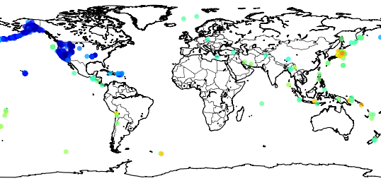
The packas has functions to plot maps of the earthquakes (using Matplotlib), see how to plot a map of the earthquakes from the past 7 days:

>>> usgs.plot_events(catalog)
<mpl_toolkits.basemap.Basemap object at 0x01E6BDB0>

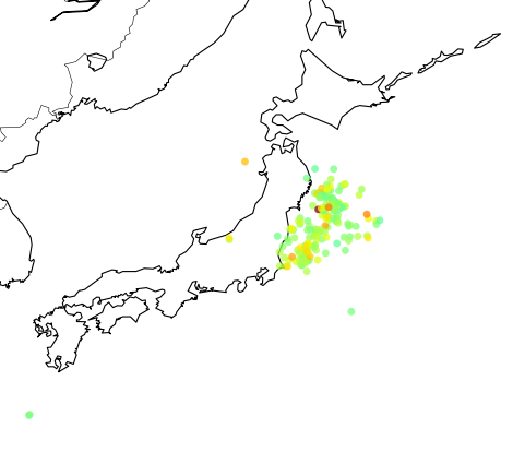
Now a zoom in the Haiti region:

The color of the points are relative to their magnitudes, I’m using here the JET (the yellow/red points are earthquakes with higher magnitudes) color map from Matplotlib, see in this link to use more color maps.

Retrieving last images from MODIS Satellites and ploting earthquakes

Let’s talk now about the “modis” module of the pyearthquake module. This module can be used to get the most recent or archived images (up to 250m resolution) from MODIS Aqua/Terra satellites. First of all, you must know what subset you want to retrieve from MODIS website, the subsets are available here in NASA site. To plot the Haiti region I’ll use the subset named “GreaterAntilles” which covers the Haiti region. To get the satellite images from today date, we can do like this:

>>> from pyearthquake import modis
>>> import datetime
>>> now = datetime.datetime.now()
>>> bmap = modis.get_modis_subset(now,
...                               "GreaterAntilles",
...                               satellite_name="terra",
...                               resolution="250m")

This command will get the composite image of the subset “GreaterAntilles” taken today from the “terra” satellite with a resolution of 250m (in fact, this will take a while, since I’m using a higher resolution here, the maximum is 250m). And here is the result:

And here is after a zoom into the Haiti region near of  Port-au-Prince:

This is the interesting part about MODIS, this photo, is from TODAY.

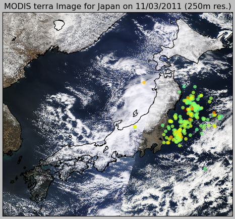
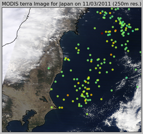
Now, let’s merge together the information about the earthquakes from the USGS data and the recent images from the Haiti:

import datetime
from pyearthquake import usgs
from pyearthquake import modis

catalog = usgs.retrieve_catalog("M1+PAST_7DAY")

now = datetime.datetime.now()
bmap = modis.get_modis_subset(now,
                              "GreaterAntilles",
                              satellite_name="terra",
                              resolution="250m",
                              show=False)
usgs.plot_events(catalog, bmap)

And here is the result of the past 7 days earthquakes plot over the today MODIS image from satellite Terra:

That’s all =) you can use the package to plot earthquakes over other regions of world too, just select another subset from the MODIS Rapid Response System site.

– Christian S. Perone

All images and data shown here are from MODIS Response System or U.S. Geological Survey.

Pyevolve, Python

Pyevolve in action, solving a 100 cities TSP problem

Here is the video of Pyevolve (the development version) optimizing a 100 cities TSP problem. I’ve used the Edge Recombination and the simple Swap Mutation method:

The video is a composition the of image outputs at every 100th generation and only when the score has changed when compared to the previous generation. I’ll release the source together with the new 0.6 release, planned to this month (December) and no later than January.

Best wishes and if I can’t post again until the next year, merry christmas and happy new year !!!

– Christian S. Perone