Time Maps: visualizing discrete events from Brazilian presidential election candidates
Introduction
This last presidential election in Brazil was heavily marked by huge amounts of money being funneled to digital agencies and all kinds of targeting businesses that used Twitter, WhatsApp, and even SMS messages to propagate their content using their targeting strategies. Even before the elections, Cambridge Analytica was recorded mentioning their involvement in Brazil.
What makes Brazil so vulnerable for these micro-targeting companies, in my opinion, is the widespread ingenuity regarding digital platforms. An example of this ingenuity was the wide-spreading of applications that were allegedly developed to monitor politicians and give information about them, to help you decide your vote, bookmark politicians, etc. But in reality, it was more than clear that these applications were just capturing data (such as geolocation, personal opinions, demographics, etc) about their users with the intention to sell it later or use themselves for targeting. I even saw journalists and some very well-known people supporting these applications. Simply put, most of the time, when you don’t pay for a product (or application), you’re the product.
One very interesting work is the experiment done by Wu Youyou in 2014 where he showed that a simple regularized linear model was better or equal in accuracy to identify some personality traits using Facebook likes, this study used more than 80k participants data:
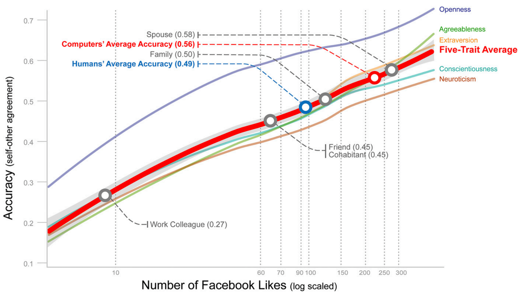
accurate than those made by humans”. By Wu Youyou et al.
This graph above shows that with 70 likes from your Facebook, the linear model was more accurate than the evaluation of a friend of you and with more than 150 likes it can reach the accuracy of the evaluation of your family. Now you can understand why social data is so important for these companies to identify personality traits and content that you’re most susceptible.
Time Maps
In this year, one of the candidates didn’t participate much on the debates before the second round and used mostly digital platforms to reach voters, so Twitter became a very important medium that all candidates explored in some way. The idea of this post is to use a discrete event visualization technique called Time Maps which was extended to Twitter visualizations by Max C. Watson in his work “Time Maps: A Tool for Visualizing Many Discrete Events Across Multiple Timescales” (paper available here). It is unfortunate that not a lot of people use these visualizations because they are very interesting for the visualization of activity patterns in multiple time-scales on a single plot.
The main idea behind time maps is that you can visualize the time after and before the events for the entire discrete time events. This can be easily understood by looking at the visual explanations done by Max C. Watson.

As you can see in the right, the plot is pretty straightforward, it might take some time for you to realize what is the meaning of the x and y-axes, but once you grasp the concept, you’ll see that they are quite easy to interpret and how many patterns it can reveal on a single plot.
Time maps were an adaptation from the chaotic field where they were initially developed to study the timing of water drops.
One way to easily understand it is to look at these two series below and their respective time maps:

But before plotting the time maps, let’s explore some basic visualizations from the two candidates who got into the second round of the general elections last week.
Basic visualizations
I’ll focus only on the two candidates who got into the second round of the elections, their names are Jair Bolsonaro (president elected) and Fernando Haddad (not elected). These first plots will show the number of tweets per day during the year of 2018 and with some red marks indicating the first and second rounds of the elections:
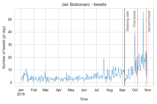
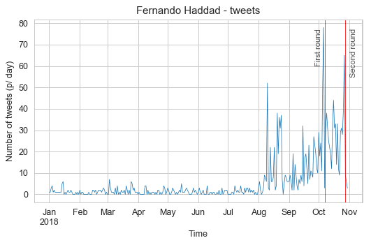 In these plots, we can see that Jair Bolsonaro was more active before the general elections and that for both candidates, the aggregated number of tweets per day always peaked before each election round, with Jair Bolsonaro peaks happening a little earlier than Fernando Haddad. I also marked with a black vertical line the day that Jair Bolsonaro was stabbed in the streets of Brazil, you can see a clear drop of activity with a slow recovery after it.
Let’s now see the time of day profile for each candidate to check the hours of the day that the candidates were quieter and more active:
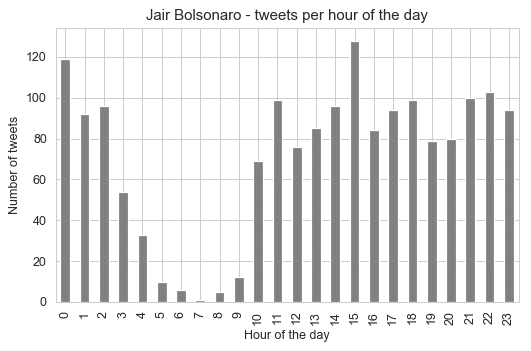
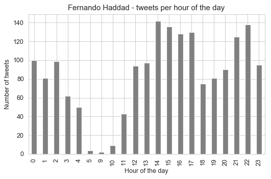 These profiles tell us very interesting information, that the candidates were most active between 3pm and 4pm, but for Jair Bolsonaro, it seems that the 3pm time of the day is really the time when he was most active by a significant margin. What is really interesting is that there is no tweet whatsoever between 6am and 8am for Fernando Haddad.
Let’s look now the distribution differences between 2017 and 2018 for each candidate:
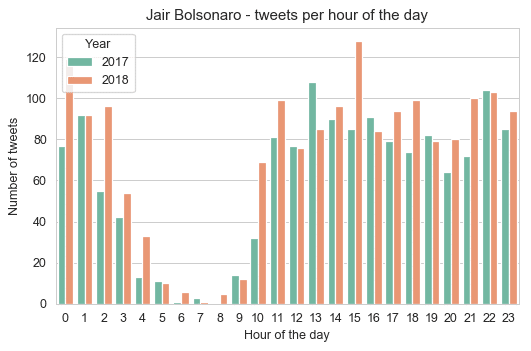
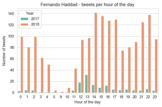 As we can see from these plots, Jair Bolsonaro was as active in 2017 as in 2018, while Fernando Haddad was not so much active in 2017 with a huge bump in a number of tweets in the year of 2018 (election year). Something that is interesting, is that the pattern from Jair Bolsonaro to tweet more at 1pm shifted to 3pm in 2018, while for Haddad it changed also from 1pm to 2pm. It can be hypothesized that before they were less involved and used to tweet after lunch, but during election year this routine changed (assuming that it’s not their staff who is managing the account for them), so there is not only more tweets but also a distributional shift in the hour of the day.
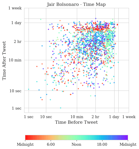
Time Map Visualization
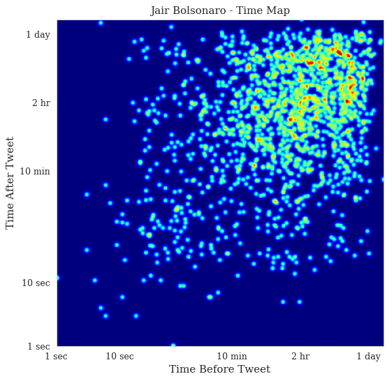
These are the time maps for Jair Bolsonaro. The first is the time map colored by the hour of the day and the second time map is a heat map to see the density of points in the time map.
And these are the time maps for Fernando Haddad:
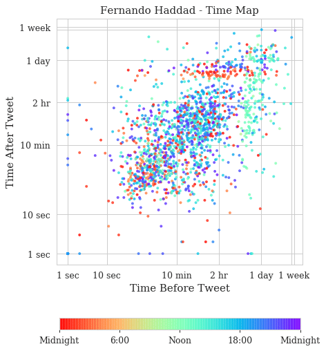
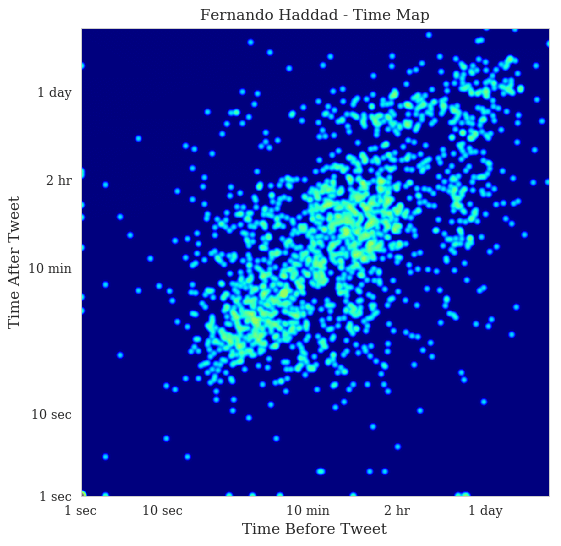 Now, these are very interesting time maps. You can clearly see in the Jair Bolsonaro time map that there are two stripes: vertical on the left and horizontal on the top that shows the first and last tweets of the day respectively. It’s a slow but steady activity of tweeting, with a concentration on the heat map on the 1-day bands. In Fernando Haddad, you can see that the stripes are still visible but much less concentrated. There are also two main blobs in the heat map of Fernando Haddad, one in the bottom left showing fast tweets that are probably from a specific event and then the blob on the top right showing the usual activity.
If you are interested in understanding more about these plots, please take a look on Max Watson blog article where he explains some interesting cases such as the tweets from the White House account.
Spotting bots with Time Maps
If you are curious about how Twitter bots appear on time maps, here is an example where I plot the tweets from the CozinhaBot, that keeps posting some random recipes on twitter:
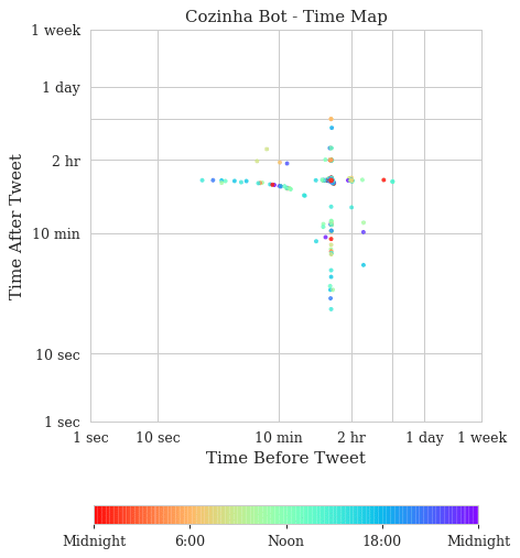
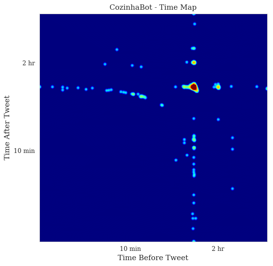
As you can see, the pattern is very regular, in the heat map we can see the huge density spot before the 2 hr ticks, which means that this bot has a very well known and regular pattern, as opposed to the human-produced patterns we saw before. These plots don’t have a small amount of dots because it has fewer tweets, but because they follow a very regular interval, this plot contains nearly the same amount of tweets we saw from the previous examples of the presidential candidates. This is very interesting because not only can be used to spot twitter bots but also to identify which tweets were posted out of the bot pattern.
I hope you liked !
– Christian S. Perone

This is very interesting Christian; just as you said, it took me a while to grasp what the plot represents, but it seems like a neat tool 🙂
On the topic of bots, this got me thinking: if you look at the timeline of tweets from a bot account, it would tend to show regularity only for the “unsolicited” tweets it is making; for a bot that is watching a particular topic and replying, the time pattern would mimic that of the other accounts it is replying to.
An interesting approach to analise an account’s behavior patterns would be to consider its replies to other tweets; in doing so, if you consider the delta between the original tweet and the reply to be the “time before”, I’d bet that bot accounts would show very neat vertical clusters in the chart – with a much less pattern in the other axis, assuming that the subsequent replies in the thread come from human accounts.