Math, News, Science

The bad good news for optimization

A new published paper called “NP-hardness of Deciding Convexity of Quartic Polynomials and Related Problems” brings light (or darkness) into a 20 years-old problem related to the whether or not does exist a polynomial time algorithm that can decide if a multivariate polynomial is globally convex. The answer is: NO.

Convex vs Non Convex Functions
Convex (top) vs Non Convex (bottom) Functions (Source: MIT News)

From the news article:

For complex functions, finding global minima can be very hard. But it’s a lot easier if you know in advance that the function is convex, meaning that the graph of the function slopes everywhere toward the minimum. Convexity is such a useful property that, in 1992, when a major conference on optimization selected the seven most important outstanding problems in the field, one of them was whether the convexity of an arbitrary polynomial function could be efficiently determined.

Almost 20 years later, researchers in MIT’s Laboratory for Information and Decision Systems have finally answered that question. Unfortunately, the answer, which they reported in May with one paper at the Society for Industrial and Applied Mathematics (SIAM) Conference on Optimization, is no. For an arbitrary polynomial function — that is, a function in which variables are raised to integral exponents, such as 13x4 + 7xy2 + yz — determining whether it’s convex is what’s called NP-hard. That means that the most powerful computers in the world couldn’t provide an answer in a reasonable amount of time.

At the same conference, however, MIT Professor of Electrical Engineering and Computer Science Pablo Parrilo and his graduate student Amir Ali Ahmadi, two of the first paper’s four authors, showed that in many cases, a property that can be determined efficiently, known as sum-of-squares convexity, is a viable substitute for convexity. Moreover, they provide an algorithm for determining whether an arbitrary function has that property.

Read the full news article here, or the paper here.

News

Hiatus

I’m going to travel on my vacations, so there will be no posts here until the end of June, farewell !

Call me Ishmael. Some years ago — never mind how long precisely — having little or no money in my purse, and nothing particular to interest me on shore, I thought I would sail about a little and see the watery part of the world. It is a way I have of driving off the spleen and regulating the circulation.

– Moby Dick

News, Python, Science

Using pyearthquake to plot Japan USGS earthquake data into the near real-time MODIS satellite imagery

The aim of this post is to show to the reader how to plot the recent Japan earthquake data from the USGS using the pyearthquake module. If you want to know more information about the pyearthquake module, take a look in this post where I previously used it. pyearthquake is a pure-python module which exposes an API to retrieve data from the USGS site as well from the MODIS Rapid Response System (recently, they created a separate project to handle Japan daily images).

Installing pyearthquake

The first thing we need to do is to install the Python pyearthquake module, you can do it using easy_install from setuptools:

easy_install pyearthquake

The easy_install should automatically handle the required modules, but if you face problems (specially in Ubuntu with basemap, here is the version requirements: matplotlib >= 0.99.0, numpy >= 1.3.0, PIL >= 1.1.6 and basemap >= 0.99.4.

Retrieving USGS catalogs

USGS provides the follow catalog datasets:

M1+ Earthquakes (past hour) – M1+PAST_HOUR

This is the worldwide catalog with earthquake data from the past hour;

M1+ Earthquakes (past day) – M1+PAST_DAY

This is the worldwide catalog with earthquake data from the past day;

M1+ Earthquakes (past 7 days) – M1+PAST_7DAY

This is the worldwide catalog with earthquake data from the past 7 days;

This is how you retrieve any of these catalogs using pyearthquake:

>>> from pyearthquake import *
>>> catalog = usgs.retrieve_catalog("M1+PAST_7DAY")
>>> len(catalog)
1179

In that context, we have 1179 incidents with magnitude 1+ from the past 7 days.

Lets filter now only events with magnitude 6+, which represents the recent significant earthquakes:

>>> mag6_list = [event for event in catalog if float(event["Magnitude"]) >= 6.0]
>>> len(mag6_list)
30

We have now 30 events with magnitude 6+ from the past 7 days, let’s print it:

>>> for row in mag6_list:
...    print row["Eqid"], row["Magnitude"], row["Depth"],
...          row["Datetime"], row["Depth"], row["Region"]
...
c0001z5z 6.3 8.70 Friday, March 11, 2011 20:11:22 UTC 8.70 near the east coast of Honshu, Japan
c0001z4n 6.6 10.00 Friday, March 11, 2011 19:46:49 UTC 10.00 near the west coast of Honshu, Japan
c0001z2t 6.1 24.80 Friday, March 11, 2011 19:02:58 UTC 24.80 near the east coast of Honshu, Japan
c0001z2a 6.2 10.00 Friday, March 11, 2011 18:59:15 UTC 10.00 near the west coast of Honshu, Japan
c0001yib 6.2 18.90 Friday, March 11, 2011 15:13:14 UTC 18.90 near the east coast of Honshu, Japan
c0001y4u 6.5 11.60 Friday, March 11, 2011 11:36:39 UTC 11.60 near the east coast of Honshu, Japan
(...)

As you can see, almost all last events are earthquakes from the Japan coast. Here, you can extract any individual event and retrieve USGS products like ShakeMaps, etc (see more information in this post on how to fetch and show those USGS products).

Plotting events into the map

Now we will plot those events into the map (pyearthquake uses the matplotlib toolkit called basemap to plot events into the map):

>>> usgs.plot_events(catalog)

The “catalog” variable is the same we retrieved before using the USGS M1+PAST_7DAY catalog.

Here is what what this statement will show:
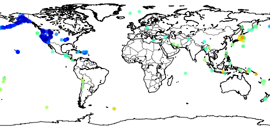
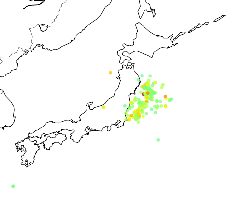
Now we can zoom into Japan using the button , and this is the result:

The colored dots are the events from the retrieved catalog, the more strong the color the more strong was the earthquake; see the dark red color near the cost, that event was the unfortunate and catastrophic 8.9 magnitude earthquake which devastated Japan yesterday.

Retrieving near real-time MODIS Rapid Response images

MODIS has processed image subsets of Aqua and Terra satellites. One of these subsets is called “japan” and it has the entire country coverage. Let’s retrieve this MODIS subset and then plot our events in this same map:

>>> import datetime
>>> now = datetime.datetime.now()
>>> bmap = modis.get_modis_subset(now,
                              "Japan",
                              satellite_name="terra",
                              resolution="250m",
                              show=False)
>>> usgs.plot_events(catalog, bmap)

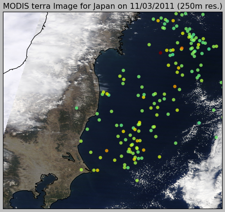
What pyearthquake is going to do here is to download (this may take some time) the entire subset for the resolution of 250m (the best available), parse the subset metadata, align image into the map between the lat/lng bounds and then plot the events over this satellite image, so we’ll have the last high resolution satellite images from the Japan together with the earthquake events plot, and here is the result:
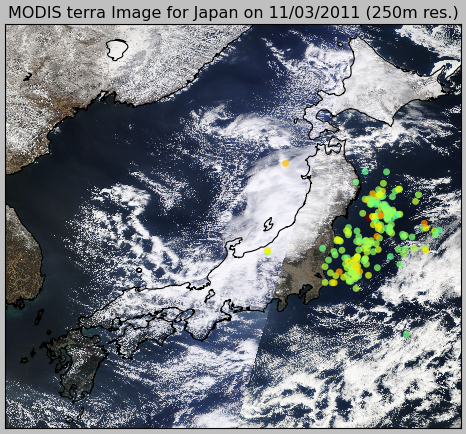
And here is the zoom near the coast:
matplotlib >= 0.99.0, numpy >= 1.3.0, PIL >= 1.1.6 and basemap >= 0.99.4
News, Python

Invite: PyCon US 2011 – Genetic Programming in Python

If you are going to PyCon US 2011, I would like to invite you to the talk “Genetic Programming in Python“, the talk will be given by Eric Floehr on March 12th 1:20 p.m. – 2:05 p.m.

Here is the abstract:

Did you know you can create and evolve programs that find solutions to problems? This talk walks through how to use Genetic Algorithms and Genetic Programming as tools to discover solutions to hard problems, when to use GA/GP, setting up the GA/GP environment, and interpreting the results. Using pyevolve, we’ll walk through a real-world implementation creating a GP that predicts the weather.

(…)

Genetic Algorithms (GA) and Genetic Programming (GP) are methods used to search for and optimize solutions in large solution spaces. GA/GP use concepts borrowed from natural evolution, such as mutation, cross-over, selection, population, and fitness to generate solutions to problems. If done well, these solutions will become better as the GA/GP runs.

GA/GP has been used in problem domains as diverse as scheduling, database index optimization, circuit board layout, mirror and lens design, game strategies, and robotic walking and swimming. They can also be a lot of fun, and have been used to evolve aesthetically pleasing artwork, melodies, and approximating pictures or paintings using polygons.

GA/GP is fun to play with because often-times an unexpected solution will be created that will give new insight or knowledge. It might also present a novel solution to a problem, one that a human may never generate. Solutions may also be inscrutable, and determining why a solution works is interesting in itself.

Genetic Algorithms, News, Science

Health and Genetic Algorithms

From R&D Mag – Developing a potential life-saving mathematical tool -:

Math and medicine are coming together to help people who have suffered an abdominal aortic aneurysm, which with 15,000 is the 13th-leading cause of death in the United States.

At the heart of the effort are genetic algorithms written by Oak Ridge National Laboratory researchers that allow physicians to more efficiently assess and organize the often vast amounts of information contained in patient reports. Ultimately, with this tool—a sophisticated way to quickly extract key phrases—doctors will be able to characterize features and findings in reports and provide better patient care.

(…)

This work builds on previous studies involving genetic algorithms developed for mammography. That system allows doctors to quickly identify trends specific to an individual patient and match images and text to a database of known cancerous and pre-cancerous conditions.

Read full article here.

toggle Sign up now! View the newsletter sample.

Developing a potential life-saving mathematical tool

Python, Time Waste

Google Analytics Visualization

Sometime ago I discovered the project called Gource, which is a Software Version Control Visualization tool created by Andrew Caudwell. Gource has a very interesting visualization structure which isn’t exclusive to Version Control systems, but also for a large variety of data; actually, you can create your own custom log (see CustomLogFormat wiki for more details) in order to use Gource visualization for your own data.

So I have created a Python script which exports the data from your Google Analytics profile and then convert it to the custom Gource log format. To extract Google Analytics data I used the Google Data API bindings for Python, you also can make your own Google Data API query (see some samples here).

My query to Google Data was:

'ids': 'ga:[profile id]',
'start-date': '2011-01-19',
'end-date': '2011-02-02',
'dimensions': 'ga:pagePath,ga:date,ga:hour,ga:country',
'metrics': 'ga:visits',
'sort': 'ga:date,ga:hour',
'filters': 'ga:pagePath!@outbound;ga:pagePath!@translate;ga:pagePath!@search',
'max-results': '500'

See that I used some filters to avoid outbound links, Google Translate links from users as well the Search option. The profile I’ve used in this example is the Pyevolve Documentation site which has two main directories (a site with more directories should provide you better visualization, since Gource is specially good on viewing branches on Version Control Systems), I also have limited the size of the results to 500, so we can get a short video.

Instead of using unique users to represent users, I’ve used countries and I also changed the default user icon from Gource to world flags (by Vathanx, you can download them here).

And here is the result (see in HD – 720p):


You can download the source code here. See the comments inside the script to use with your Google Analytics Profile. In order to get flags working, you need to extract the flags to a directory and then run “gource custom_log.txt –user-image-dir [directory-with-the-pngs]“.

I hope you enjoy it =)

– Christian S. Perone

Article, Genetic Algorithms, genetic programming, News, Science

Darwin on the track

From The Economist article:

WHILE watching the finale of the Formula One grand-prix season on television last weekend, your correspondent could not help thinking how Darwinian motor racing has become. Each year, the FIA, the international motor sport’s governing body, sets new design rules in a bid to slow the cars down, so as to increase the amount of overtaking during a race—and thereby make the event more interesting to spectators and television viewers alike. The aim, of course, is to keep the admission and television fees rolling in. Over the course of a season, Formula One racing attracts a bigger audience around the world than any other sport.

Read the full article here.